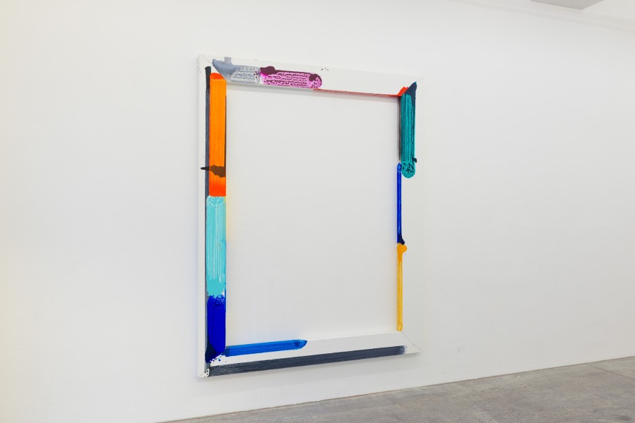
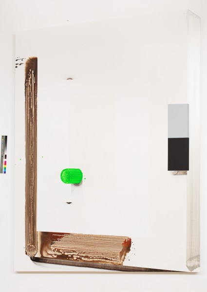
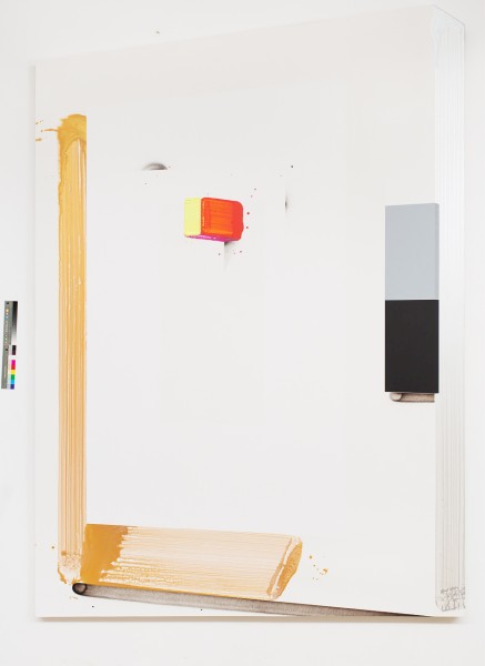
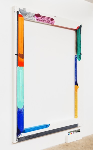
The cycle Green serie - No.2B, 277,5 cm x 196 cm, acrylic on canvas, 2015
The cycle Red serie - No.1, 277,5 cm x 196 cm, acrylic on canvas, 2015
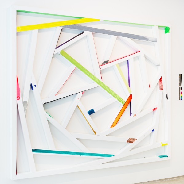
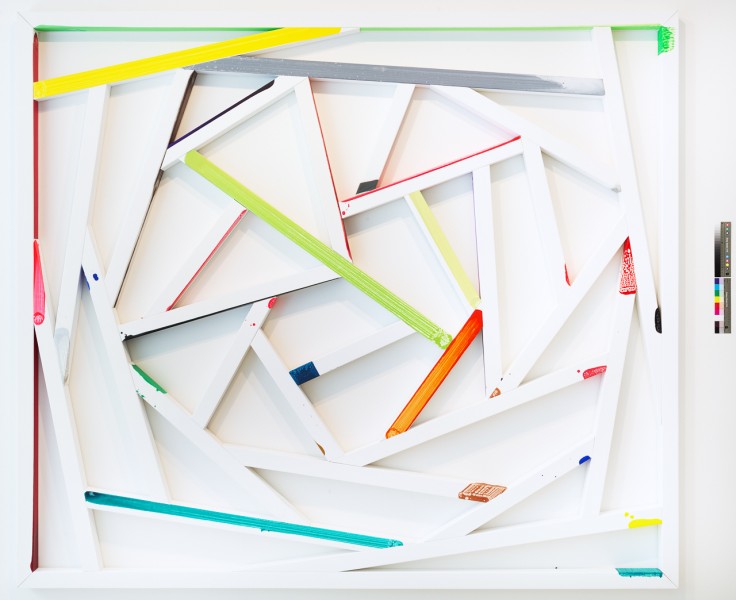
The cycle Cubes - Composition No.1, 270 cm x 390 cm, acrylic on canvas, 2010
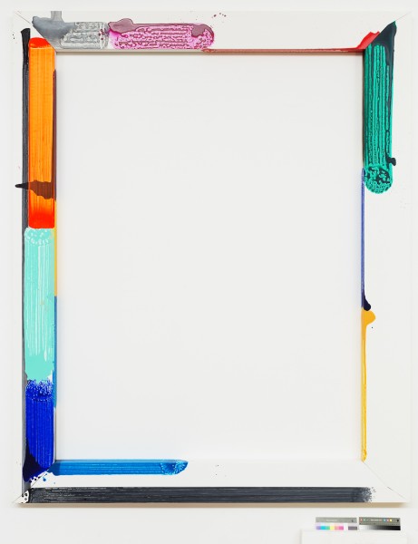
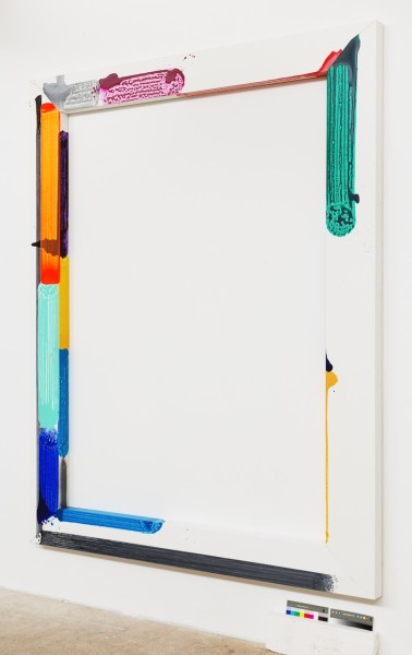
The cycle David Hanvald and typography - „K.Taige, V. Nezval, 220cm x 135cm, acrylic on canvas, 2013
The cycle Folklore skill - The fence No.3, 208 cm x 239 cm, acrylic and sprey on canvas, 2014
The cycle Folklore skill - The fence No.3, 208 cm x 239 cm, acrylic and sprey on canvas, 2014
The cycle Folklore skill - The fence No.3, 208 cm x 239 cm, acrylic and sprey on canvas, 2014
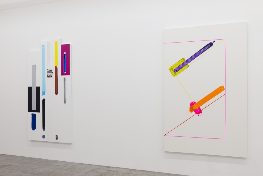
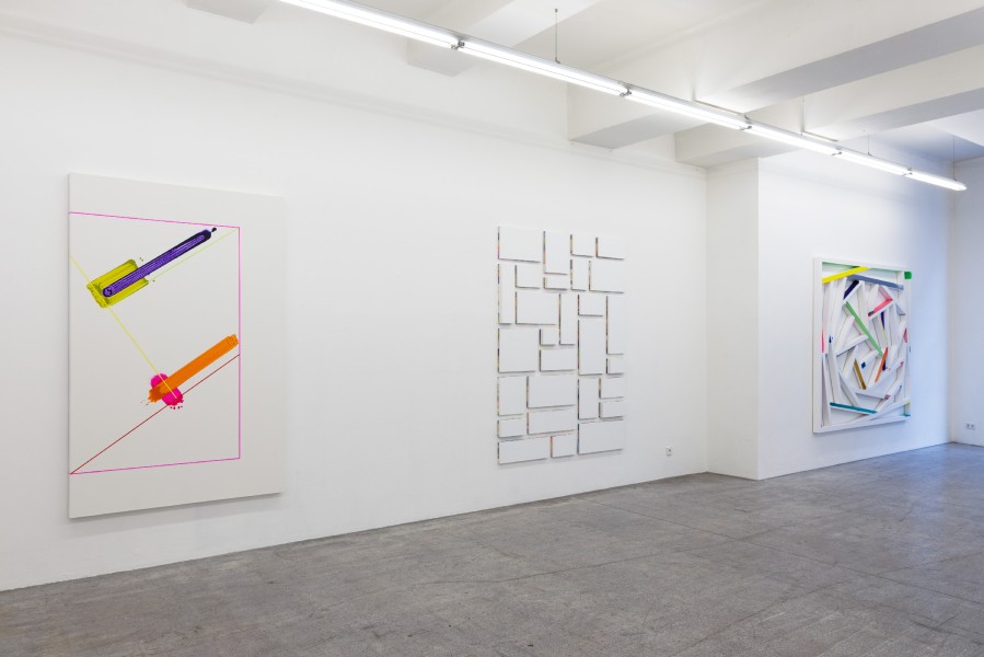
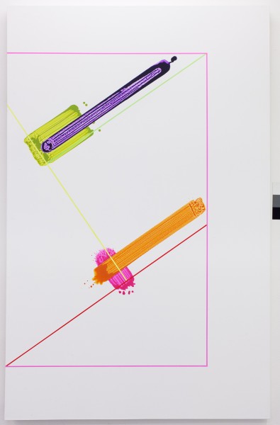
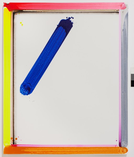
The cycle Titles - Shape of blue, 239 cm x 194 cm, acrylic and sprey on canvas, 2015
The cycle Titles - Shape of blue, 239 cm x 194 cm, acrylic and sprey on canvas, 2015
The cycle Titles - Shape of blue, 239 cm x 194 cm, acrylic and sprey on canvas, 2015
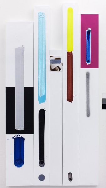
The cycle David Hanvald and typography, 230 cm x 145 cm, acrylic and spray on canvas, 2013

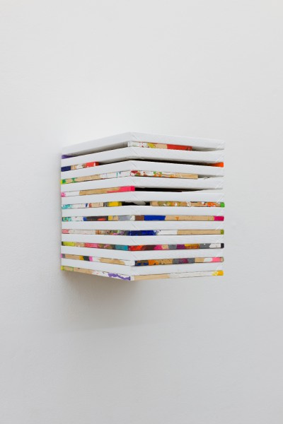
The cycle Kunst - history - XX, 30 x 25 x 25cm, asemblage on canvas, 2014
The cycle Titles - Shape of blue, 150 cm x 127 cm, acrylic and sprey on canvas, 2014
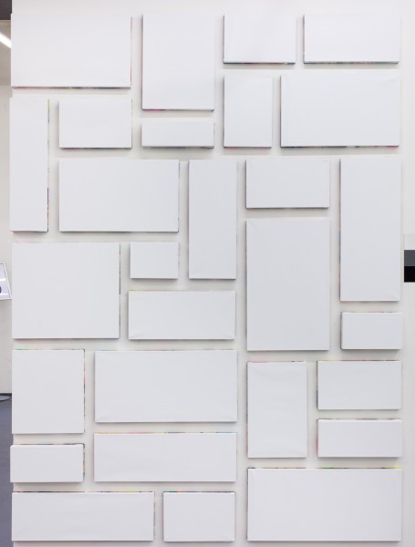
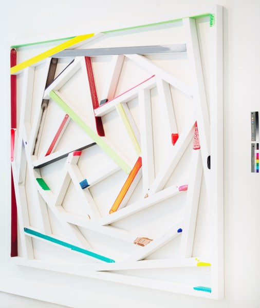
The cycle Kunst - history - No.17, 220 cm x 160 cm, asemblage on canvas, 2013
The cycle Kunst - history - No.17, 220 cm x 160 cm, asemblage on canvas, 2013
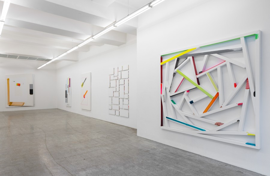
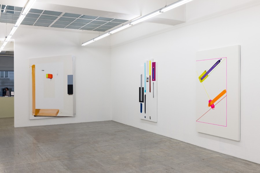
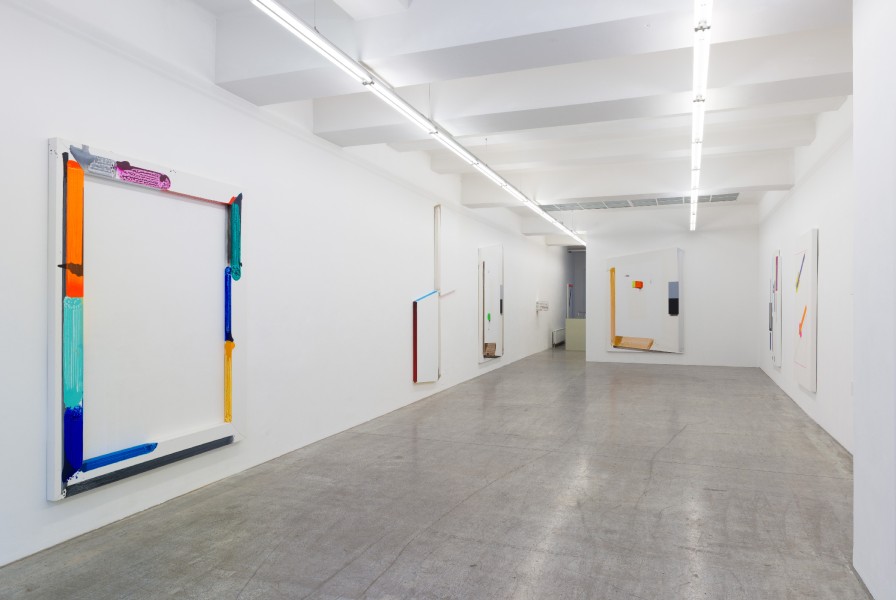
Colorful inscriptions and compositions on a white ground, gesturally rendered block-like constructions suggesting the frame of the canvas – David Hanvald’s works consistently evince an aesthetic of the fragmentary. His paintings have a spontaneous, playful, but also fragmentary and improvised quality. Whereas his earlier works possessed oblique references to examples from art history and icons of contemporary art and architecture, including Louis Kahn, Sol LeWitt and Donald Judd, in recent years the medium of color in particular has functioned in an increasingly immediate and independent capacity. Color is a playful element that has an effect on the viewer, but beyond this phenomenological dimension Hanvald manages to lend the reception of the aesthetic process a certain open-endedness, enabling his paintings to remain polysemic. It is in this context that we can understand his often recurring references to children’s toys, to colored blocks (Construction Toy, 2011). The toy serves as an analogy for the artistic, aesthetic process. It opens a space of aesthetic possibility, which on the one hand is determined by instructions and rules, and on the other allows for variability and aleatoric strategies conveying a sense of unboundedness. Hanvald creates a visual system that produces repetition and the thus-intended element of redundancy and simultaneous divergence, confusion and rupture. He develops a painterly and installation-based dispositive that is then undermined and destabilized by aesthetic and playful strategies. In the series System, Construction, Order (2009), the paintings’ formal point of reference is never-implemented architectural designs by Louis Kahn. A book from a used bookstore that fell into Hanvald’s hands by chance forms the starting point for a series of loosely related images. On these historic materials, he imposes a subjective and intuitive painterly reading; it is neither a discursive nor a contextual approach, but instead is purely visual and formal. Hanvald is interested in neither the symbolic nor the historical significance of the artist, and his works are not referential or reflective of art history in a traditional sense. Instead, he considers the collective reception of modern architecture, which to a great extent takes place and is perpetuated semi-consciously or unconsciously. He is concerned with the fact that, through processes of distribution and canonization, certain forms and formal vocabularies have become a kind of “common sense” and are now found in multiple contexts – in architecture, art, and even in the mundane. Something comes full circle in Hanvald’s aesthetic practice: Although he examines – from the top down, as it were – the trivialization of art, thus creating an intersection with the everyday, he simultaneously integrates – from the bottom up – a simple wooden toy and shifts it into the realm of art. Although this series and the other works shown at the exhibition Upgrade – From Louis Kahn to Sol LeWitt, Including Bruce Nauman (House of Art, České Budějovice, 2011) still contain loose references to canonical positions in constructivist and minimalist art and architecture, Hanvald’s paintings produced in the following years are increasingly non-referential and self-referential. Colors and abstract compositional components unfold a playful but increasingly autonomous presence and agency. Hanvald’s work is emphatically rooted in the practice of painting. Its approach is pictorial, interrogating the relationship between figure and ground, between the action of the image and the image frame or image center, while reflecting the element of temporality inherent to the act of painterly composition. Beyond such aspects pertaining to the internal workings and composition of the image or to a reflection of the painting process, Hanvald’s work can also be understood in the context of an expanded notion of painting. One could describe it as a form of installative painting. The surface of the canvas is by no means the sole and exclusive “place” of the pictorial action. Through the use of often bright “signal” colors and minimal, gestural markings, Hanvald manages to go beyond the individual image and bring together disparate and to some extent fragmentary canvases into a spatially activated constellation of images. Color functions as an autonomous agent capable of evoking pictorial space, but without being limited to a flat surface. This ability to transcend and negate the boundaries of the image happens naturally, almost incidentally. From the beginning, David Hanvald has been concerned with finding the means to circumvent or subvert the act of painting, the choice of artistic devices, and aesthetic decision-making. His intention is not just to question will as a formative capacity, but to consciously negate it. He specifically counters the notion of the “skillful” picture confidently developed by the artist in relation to space through the use of playful, aleatoric, or even random elements as definitive of an aesthetic of production. The true crux of his aesthetic strategy lies in the directionless nature of the artistic process. The material is to be made to “function” within the aesthetic process, without being instrumentalized by the impetus of genius. For Hanvald, the moment of greatest possible freedom is founded on the material and not on the status of the artist within the context of the painting process.
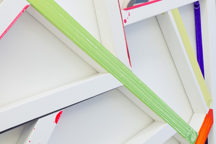
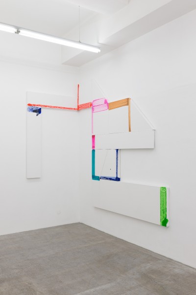
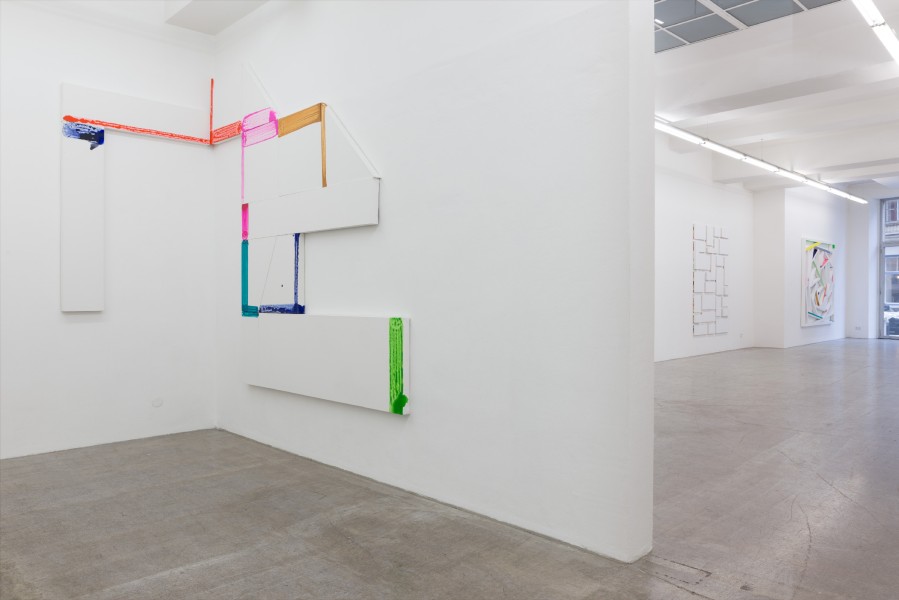
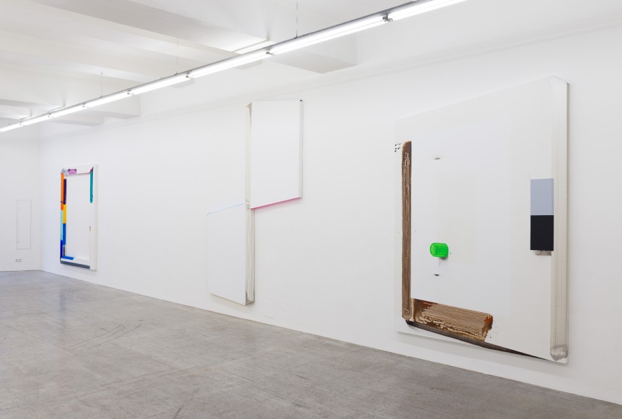
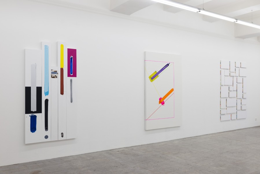
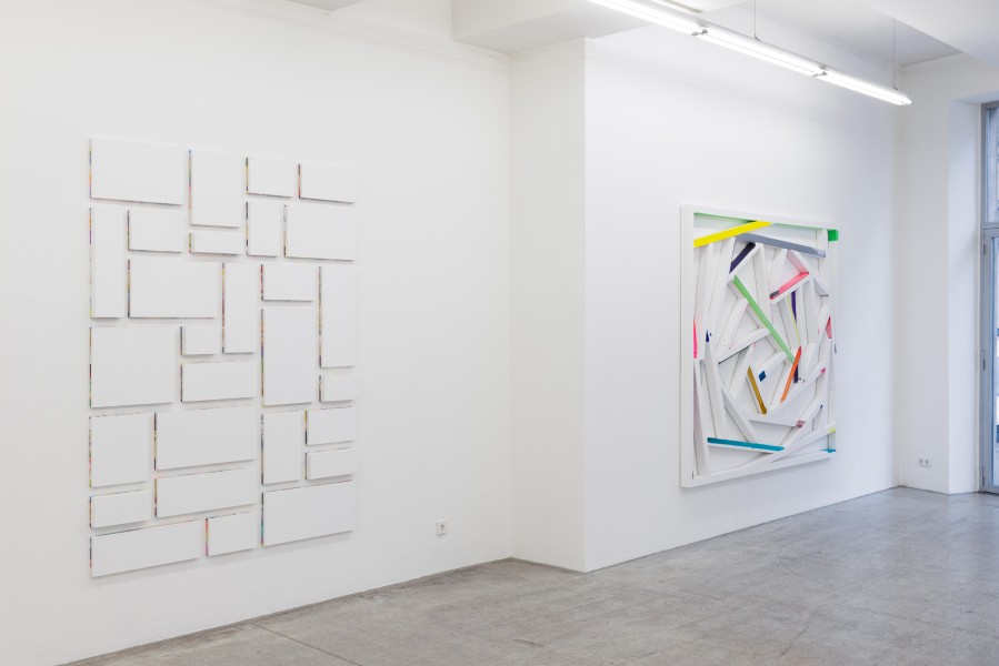
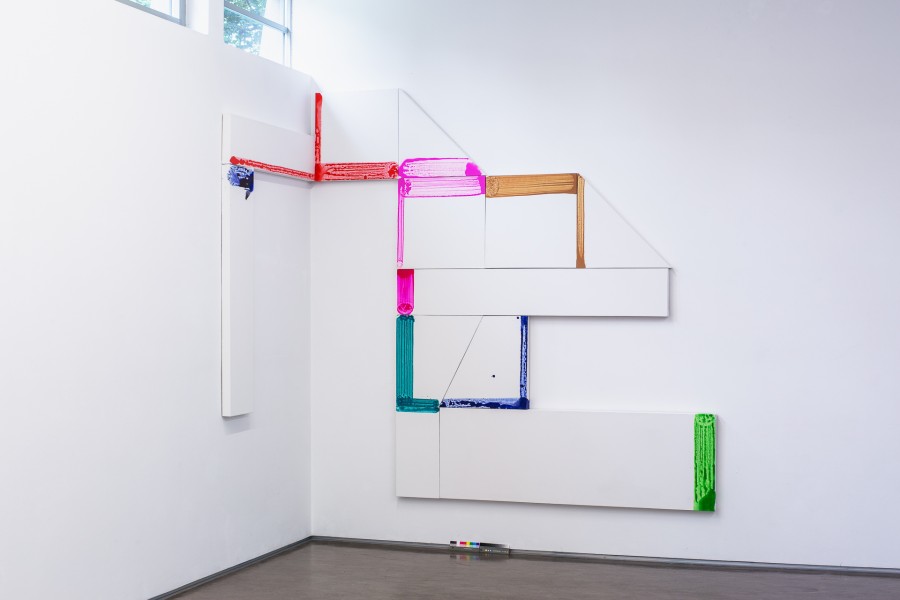
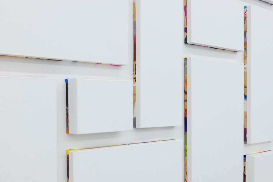
In Construction Toy / Der Baukasten Hanvald presents an arrangement of images, a composition that unfolds in space and that veritably “goes around the corner.” The impression that it conveys – of an extended wall of building blocks – is not coincidental. Hanvald has shaped the canvases like bricks. The constellation of paintings, the composition of the work, can thus be assembled differently each time. The application of paint to the individual components resembles markings and transforms the two-dimensional building elements into potentially aesthetic units of construction through the smallest imaginable artistic intervention. To a certain extent, Hanvald’s ironic and iconoclastic series of images leaves the viewer perplexed. Where we expect to find an image, we discover an apparently random arrangement. Nevertheless, despite all his efforts to subvert the intentional act of pictorial creation, he manages to present the viewer with a space of aesthetic possibility in which our own gaze is engaged as a formative agent – a process that is thus made obvious and observable. In recent years Hanvald’s works seem to be increasingly pervaded by an aesthetic of absence. He empties the center of the image, even removing the image medium, the canvas itself, thus confronting the viewer with just the wooden frame, which is forced to asserts itself as the actual medium of the image. To an ever greater extent, his focus is on the non-image, the absence of color and form. The non-visible carries as much aesthetic weight as iconic, painterly events. In a number of paintings, the frame becomes the place where the action of the painting takes place; in others, he makes references to the frame or its shadow through the use of paint. This occurs by no means in a mimetic or illusionistic manner. These areas of the image are marked by a colorful and abstract, almost gestural manner. The immediacy of the brushstroke seems to convey an imperative quality, pointing towards intentionality as an inherent part of the painting process – a final reference to or even ironic commentary on the painter as an autonomous subject. In addition, Hanvald works with his own “color system,” whose aim is to prevent any conscious or unconscious implementation of familiar systems of color organization. When necessary, he takes a pragmatic approach to adding to his color palette – by simply taking the next color in the paint producer’s sequence of color codes. One could say that Hanvald uses a system against a system as a means of negating any form of aesthetic decision-making. He creates rigid, formal rules to circumvent the latent reproduction of aesthetic conventions (of color and form). In his work, Hanvald tries to open up for the viewer a visual dimension of iconic variability and aesthetic potentiality. He creates a kind of three-dimensionalized non-image that vacillates between spatial object and two-dimensional picture, in the process assuming a precarious iconic status. The medium of color cannot be reduced to a material, physical element in the sense of a surface phenomenon or an object’s characteristic. Instead, it shows itself to be an ephemeral process. The neon-like tones used by Hanvald feel like a film-like layer through which we see an altered reality. Color phenomena are concentrated into perceptive events in the eye of the observer. Still, apart from the aesthetic dimension guiding the reception of the works, color functions as an agent that takes on a phenomenological presence. Color thus gives rise to the actualization of perception, a visual realization on the part of the observer. This dual function of color as simultaneously a physical presence and a fleeting and immaterial phenomenon overlies each perceptual situation. As a result, any referential content of the visible, as found in Hanvald’s earlier works, is diminished, the referenced object is ultimately transcended, and perception itself becomes the real site of aesthetic interrogation.
(cai) Making a painting is easy. All you have to do is stretch a canvas and add some paint. Sign it and you’re done. And if that isn’t enough for someone, you can always have the whole thing framed. David Hanvald uses all the same ingredients as most other painters (wood, canvas, paint), but he also like to try out new and fresh recipes. (Although they do contain a healthy serving of art history: minimalism, analytical painting, …) Then he playfully mixes it all together. But painting a wall… that isn’t art, is it? Sure it is. In any case, the Kerstin Engholm Gallery is exhibiting the work of an anonymous wall painter by framing a particular part of the wall. In other words: they’ve hung up an empty picture frame. Or is the frame itself the painting? Hanvald has stretched a canvas across it and decorated it with carefully planned strokes of the brush. And just look at how he suffices with just a few controlled gestures, seducing the viewer with his almost kitschy iridescent colors. Is he somehow tearing down the ingrained prejudice that the frame must be outside and the image inside?
Hanvald’s seemingly white canvases possess a mysteriously colorful “haze.” The aura of unpainted images? No – reflections on the wall. Who says that the paint has to be on the canvas? (Meaning: the front.) Panel paintings with distorted perspectives trick our brain into thinking that we are looking at them from an angle. This optical illusion is amplified by two-dimensional trompe l’oeil. Achieving maximum tension and stimulation with as few means as possible – now that is art.
With a solo exhibition by David Hanvald, Vienna’s Kerstin Engholm Gallery gave Austria’s art-going public its first opportunity to see the work of this representative of the middle generation of Czech artists. The sensitively renovated exhibition space on Schleifmühlgasse – Vienna’s “gallery mile” – offers the ideal conditions for presenting Hanvald’s modernist-inspired paintings and accentuates the works’ architectural qualities. The untitled exhibition presents a selection of works from the past circa thirty years and was put together in collaboration with curator Martin Dostál. In his work, Hanvald repeatedly makes conscious use of and liberally reinterprets older works of art, architecture, and applied design. Instead of calling them into question, however, he engages in a formal analysis and exploration of the historical development of the medium of painting. One artist whose work Hanvald has interpreted in the past is the Russian modernist El Lissitsky. When it comes to the Russian modernists, Hanvald’s study of form has taken place “from the inside.” The modernists’ liberation of form cannot be imagined without the influence of the era’s philosophical and mystic doctrines such as the writings of Russian philosopher Petr Demyanovich Ouspensky, or Rudolf Steiner’s Theosophical Society with its emphasis on the visual aspects of spirituality. For Malevich, life in a three-dimensional world was a question of transience and limits, and so he worked to find a fourth dimension.
Hanvald takes a neutral stance to the modernists’ yearning for spiritual transformation. He works with historical artifacts as concepts and visual forms by which he develops the question of the three-dimensionality of painting. The exhibition thus shows several pieces that literally break out of the picture frame – some works, for instance, consist of multiple canvases of varying formats (Art-History XVII, 2013), while others trick the eye by having one side jut out into space (Green Series no. 2B, 2015) or they consist of several variations on themselves (Art-History XX, 2014 – here we find a similarity to the work of the American minimalist Donald Judd). The works’ original meaning loses any clear content-creating function, resulting in a contrast between the original, seriously intended content and the impersonally superficial aesthetic autonomy of Hanvald’s reinterpretation, though without disqualifying the contemporary result.